Tracking Sentiment and Popularity Across Online News and Events
Background
In the following study we use data from the first iteration of the Global Database of Events, Language and Tone (GDELT). GDELT captures events as they are published on the Internet in 100 different languages, effectively creating a “global catalog of world events… from protests and military attacks to peace appeals and diplomatic exchanges” . The dataset has been running from January 1979 to present, updating daily. GDELT is currently comprised of more than 300 million distinct events. We access the GDELT dataset through Google Cloud’s BigQuery service. We query only 5 specific fields in the GDELT dataset: GlobalEventID (used as a unique identifier for each event), Year, NumMentions (the number of times a particular event is mentioned online), AvgTone (a measure of the tone of the article as more or less positive), and GoldsteinScale Score (a scale for how the event impacts the stability of the country where the event unfolds).
Questions
How much attention (number of mentions) do online events attract on average?
How does the tone of event reporting (as captured by AvgTone) vary with the potential impact that each event may have on the stability of the country in which it evolves (as measured by GoldsteinScale)?
Methods
We begin by inspecting univariate statistics for the variables used. We produce traditional summary statistics (range, mean, and standard deviation) and frequency tables where appropriate. We also produce histograms (and bar plots where appropriate) in order to look at the distribution and skew of each variable. This is important for linear models operate on the assumption that variables are, to some extent or another, normally distributed and symmetrical. Additionally, where appropriate, we apply logarithmic transformations (to one or both axis of our histograms) in order to better understand the distributions. We also inspect bivariate relationships. In order to do so, we produce scatterplots for the variables in question, looking at the shape and (linear) fit of relationships.
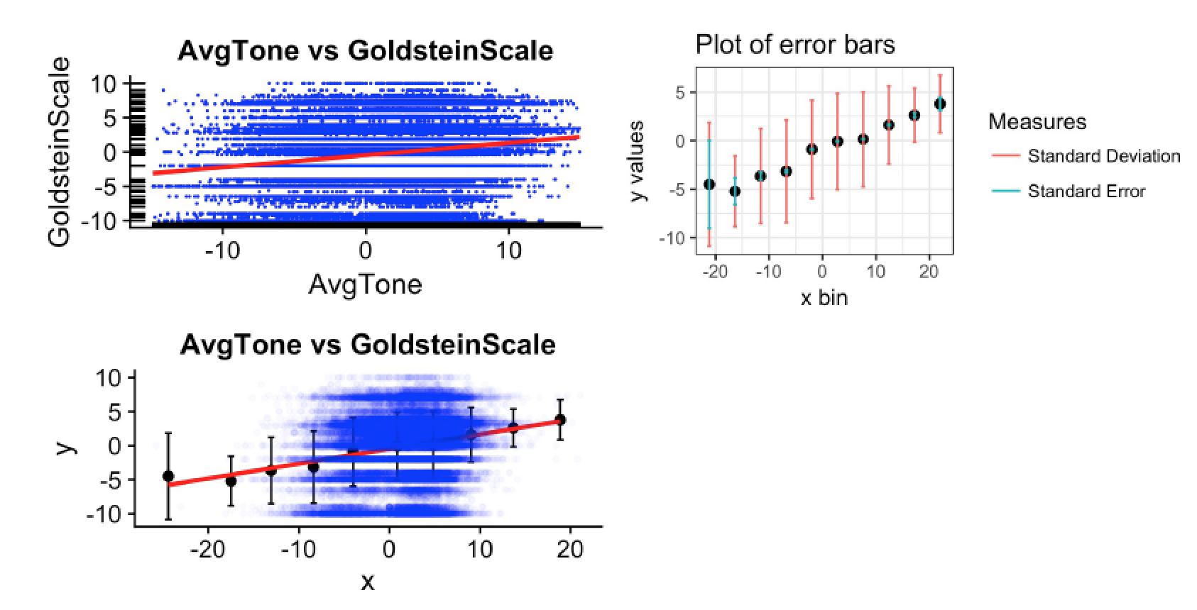
In the cases in which the density of the data impacts both our ability to interpret the shape of the relationship and the fit of the linear model drawn through the data, we bin our variables on the x-axis and produce error bars to inspect the variability within our bins. Once binned, we proceed to draw a new line of best fit using a linear model once again. We also produce summary statistics for our linear models in order to understand their predictive power. In particular, we focus on p-values (to assess significance) and on R2 values (to asses the predictive accuracy and strength of our model).
Findings
(See images below)

Univariate Analysis of NumMentions
The graph on the left of this grid portrays the original (untransformed) distribution of NumMentions. This graph, however, makes it hard to interpret the distribution of our variable. Applying a log transformation to both axes, however, it becomes apparent that NumMentions follows a power-law distribution (also known as a long-tailed distribution). Intuitively, this would make sense as there is a small subset of world events that receive a disproportionate amount of attention (this subset might include major world events like the crash of a financial market or a terrorist attack).

‘AvgTone vs GoldsteinScale’ Bivariate Relationship
From the top-left graph, we see that the fit of our regression line and data seem rather underwhelming. This can be confirmed by looking at the R2 measure (0.02483) for the model in Figure 6 (we can interpret this because the p-value < 0.05 and therefore the model is significant). Because this is a PRE measure, we can interpret this as meaning that our model can predict 2.48% of the variation in GoldsteinScale scores by using AvgTone. Initially, this seems rather odd for we would expect to see some sort of linear relationship between the impact that an event has on stability (GoldsteinScale) and the way in which it is talked about in the news (AvgTone). The bottom-left graph shows the best-fit line for the data on these bins. By inspection, the fit already looks much stronger with binned data. The summary statistics for this model (as shown in Figure 8) confirm this. In particular, we note that the R2 measure has gone up to 0.9499, meaning that once we bin the data, a clear relationship becomes apparent between AvgTone and GoldsteinScale (as we suspected originally).
We note that the p-value for the model is still well under our threshold. Furthermore, we interpret the coefficient for AvgTone in the model to mean that for every one unit increase in the GoldsteinScale, AvgTone increases by 0.216 units on the AvgTone scale. This makes sense for as events have a greater impact on the stability of a country, the tone with which they get reported becomes more agitated.